Paint or photoshop?
“Are we building Microsoft Paint or Adobe Photoshop?”
It’s one of the questions we ask ourselves at the beginning of every project. Let me explain.
Obviously, we’re never actually building Paint or Photoshop. (Although somebody did build a web version of Paint I’m in love with: https://jspaint.app.) What we’re really asking is: are we building this for experts or beginners?
Microsoft Paint and Adobe Photoshop do essentially the same thing. They both create computer graphics. But one is so simple your five your old can learn it without any instructions. The other can take years of training and practice to master.
The trade-off for Paint’s simplicity is most of the artwork looks like this...

Whereas with Photoshop, you can turn a simple photo of a seal into a masterpiece like this…

Images via BoredPanda via Reddit (probably).
Good design depends on the audience. A good design choice in one product may be a terrible choice in another product.
Take keyboard shortcuts, for instance. Keyboard shortcuts are a terrible UX pattern for beginner software like Paint. If you don’t remember all of the shortcuts, you won’t be able to do anything. But they’re incredibly useful in a tool like Photoshop, where there are hundreds of options; keyboard shortcuts prevent power users from having to waste precious time digging around in menus.
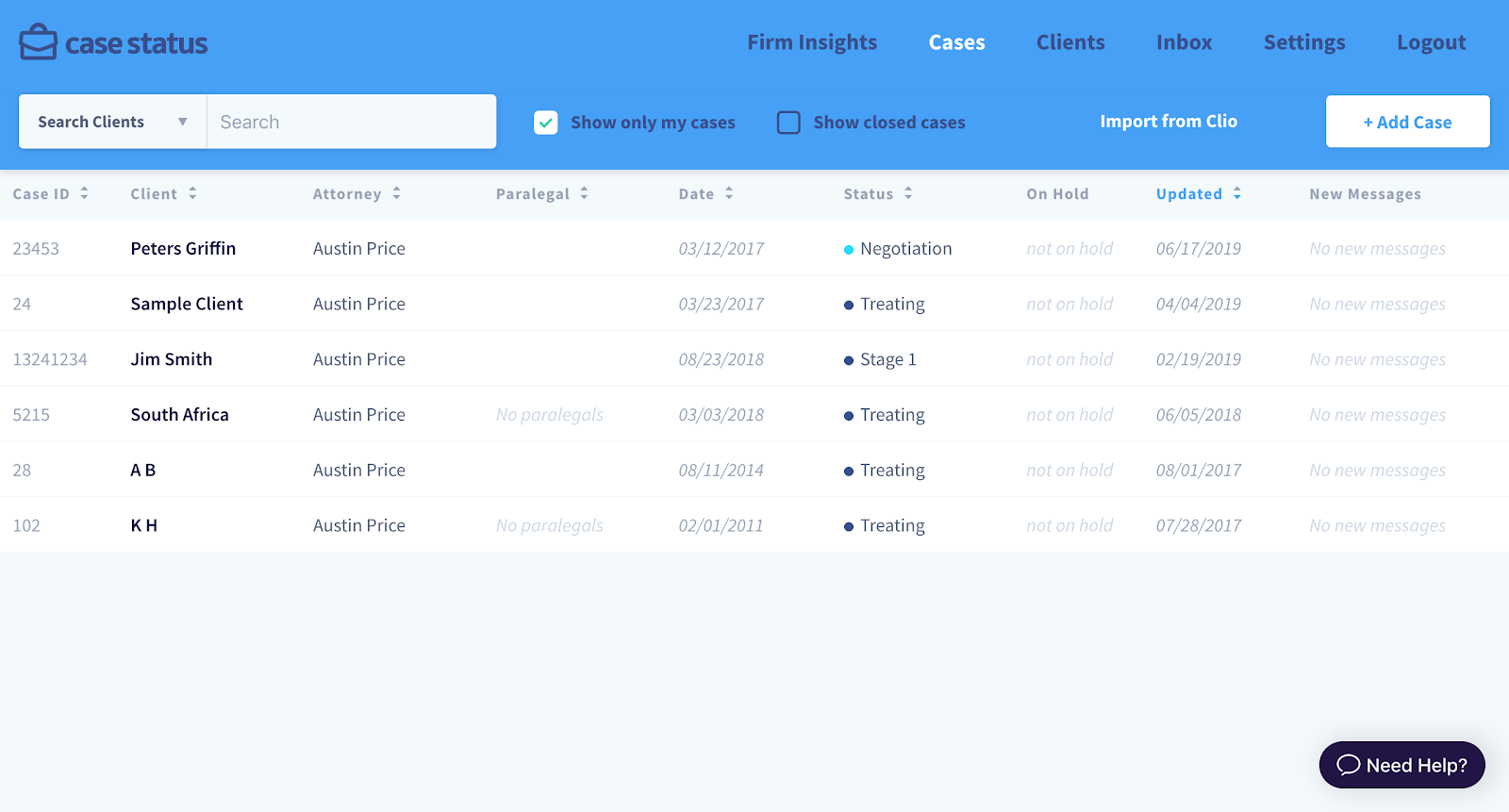
Or consider the following tables from two different applications we designed and built.
Case Status:

B3iAnalytics:

At first glance, the Case Status table looks well-designed, while the B3iAnalytics table looks like, well, a mess. But we designed the apps for two totally different types of users.
We designed Case Status for busy attorneys who are already overwhelmed with everything they have to do. Case Status is priced relatively low, so the team tries not to spend too much time onboarding each user.
This all means the application needs to be intuitive and un-intimidating. Users need to be able to come in and feel at ease. If using the app feels like too much work or another thing to learn, then we’ll lose them. So we designed the app with lots of white space and calming colors.
Meanwhile, B3iAnalytics is used primarily by top-level administrators at large research universities. They’re poring over huge amounts of data and need to be able to take in lots of inputs to make smart, impactful decisions. The platform is priced relatively high, and the team takes a consultative approach with each new customer. There’s time to train them on how everything works, what to look at, and what to infer from the numbers.
This means we made some trade-offs when we designed B3iAnalytics. We reduced the amount of whitespace in order to fit more information on the screen at once. Settings are often more powerful than intuitive. And we use color to convey information first and foremost. Red is bad, green is good.
Neither approach is wrong. It all depends on who you’re designing for. So if you’re thinking about building a new software product, ask yourself—should you be building Paint or Photoshop?
